Whether you’re applying the first coat of paint or simply want to give your home a new look, you’re probably aware of the importance of picking the right palette.

You’re also aware that this is by no means an easy task. There are literally 10 million colours that you can choose from. If you’re stuck in colour limbo and can’t seem to make up your mind, we’re here to help.
Room Atmosphere & Vibes
Do you want the room to be energetic and upbeat? Or maybe you want it to be a place of relaxation and contemplation?
Your choice of colour will greatly affect the atmosphere of the room. Do some reading on colour psychology and think about whether your colour choices tie into the purpose of the room.
Here are some examples to show you how mood ties into colour.

Orange conveys enthusiasm and energy
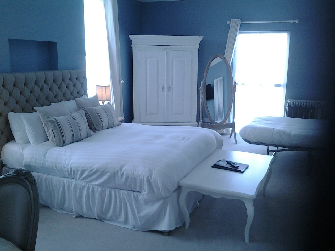
Blue is incredibly calming (or pretty depressing depending on the shade)
Green is also calming and promotes focus and concentration
Pick a Colour Theme
With 10 million shades to choose from, there’s an infinite number of colour combinations you can go with. Given that, the easiest way to pick colours is to decide on a theme.
You could use a monochromatic theme if you want to keep it simple and stick to the basics.
Contrasting colours will give the room real energy and looks very distinctive.
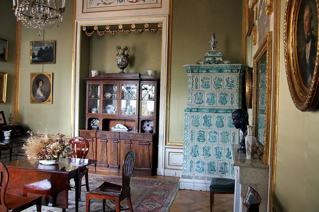
Complementary colours are always a safe option since they set each other off beautifully.
Consider the Layout
Since you’re not simply painting on a canvas, you need to think about whether the colours you’ve chosen work in your home’s layout. When rooms connect or if you can see into one room from the next, the colours you’ve chosen for each need to work well together.
Walk around your home to give yourself a better idea of what would work where. Everything that is visible at the same time must be cohesive.

It’s common to give individual rooms bold colour schemes while sticking to neutral colours for connecting spaces like corridors.
The 60-30-10 Rule
This is a really simple principle that is tried and tested.
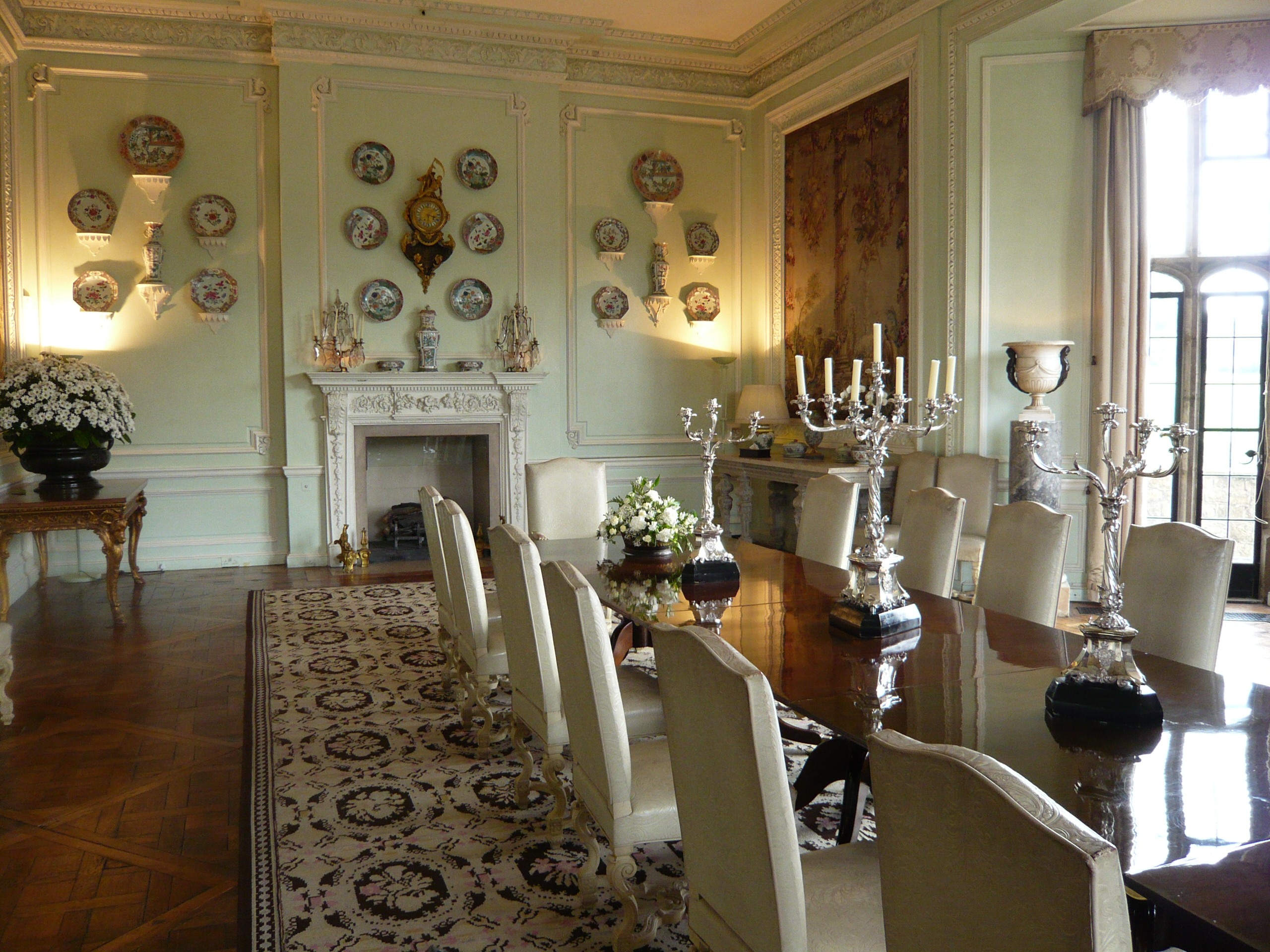
These are the ratios of different colours in a room. Stick to three main colours: 60% of the room should be the dominant colour, 30% should be the secondary colour, and the last 10% is reserved for an accent colour.
If you’re keen on adding another shade into the mix, you could split your secondary, supporting, colour into two different, but complementary shades.
Stick to this rule and there’s not much that can go wrong.
The Role of Lighting
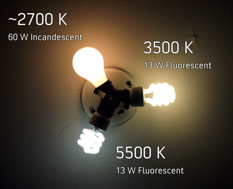
Think about how the room is eventually going to be lit. The kind of light that you use to illuminate a room can change how the colour is perceived.
Incandescent lights make warm colours pop, while fluorescent lighting really brings out the cooler colours. If you’re not careful while picking out your colours, the lighting could either make them too intense or too dull.
That’s about it! Once you’ve settled on a palette and argued about it extensively with your significant other, break out those overalls and paint brushes, and get to work. Or you could sit, back, relax and let the professionals do their job.